
Purpose-built letterforms
Letter shapes are considered around the exact word and its intended placement.
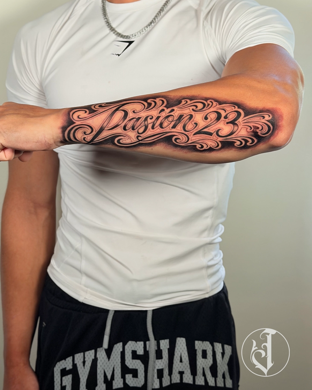
Tattooed by Joshua · Melbourne
Lettering tattoos turn words, names and phrases into designed forms. Readability depends on letter construction, spacing, scale and how the baseline follows the body.
What makes this style unique
Letter shapes are considered around the exact word and its intended placement.
The spaces between and inside letters help keep the wording clear at the chosen size.
Lettering can follow a straight line, curve or wrap to suit the placement.
Decorative strokes should support the wording without crowding the letters.
Line weight and open space help separate the lettering from surrounding detail.
The complete word or phrase needs proportions that suit the available space.
History and evolution
Tattoo lettering draws from sign painting, calligraphy, blackletter, Chicano script and hand-drawn typography. Each tradition has its own rhythm and cultural associations.
Subjects and concepts
Why clients choose it
Longevity
Letter spacing and counter size matter more than screen sharpness. Thin scripts and tiny blackletter can close up, so Joshua may recommend larger scale or fewer words.
Artist-led planning
Joshua redraws lettering for the exact word and placement rather than stretching a downloaded font. Flourishes are used to solve space and flow, and small counters are opened enough to remain readable as ink settles.
Best body placements
Forearms suit long phrases; chest and collar areas support arcs; necks require bold scale and commitment; hands and fingers need simplified lettering because of wear.
Planning your tattoo
References, placement photos and approximate size establish the brief. Composition, sessions, healing and future extensions are considered before the direction is confirmed.
Read the preparation guide →Portfolio
Genuine work demonstrates the scale, contrast and composition discussed here.

Frequently asked questions
Practical answers about planning, pain, healing, cost and long-term readability.
Lettering tattoos turn words, names and phrases into designed forms. Readability depends on letter construction, spacing, scale and how the baseline follows the body.
Tattoo lettering draws from sign painting, calligraphy, blackletter, Chicano script and hand-drawn typography. Each tradition has its own rhythm and cultural associations.
Its defining traits include purpose-built letterforms, consistent spacing, body-led baseline, controlled flourishes. They must work together as one readable composition rather than isolated effects.
Joshua has relevant lettering & script or closely aligned work in the published portfolio. Every enquiry is still reviewed for subject, placement, scale and fit.
Popular directions include names and dates, memorial phrases, chicano script, blackletter words, neck lettering, forearm statements. The final artwork is redrawn around the body and personal brief rather than copied from another tattoo.
Forearms suit long phrases; chest and collar areas support arcs; necks require bold scale and commitment; hands and fingers need simplified lettering because of wear.
Only when the essential shapes and spaces remain clear. If the requested detail will not age cleanly, Joshua will recommend simplification or a larger size. In Lettering & Script, purpose-built letterforms and consistent spacing must both remain visible at that scale.
Yes, when the design language connects around the limb and moves across joints. A sleeve needs focal areas, transitions and quieter negative space rather than unrelated images forced together. For Lettering & Script, Joshua maps purpose-built letterforms around the limb before individual subjects are finalised.
Pain depends more on placement and duration than style. Ribs, sternum, knees, elbows, hands and feet are usually more intense than outer arms or thighs. With Lettering & Script, the passes needed to build purpose-built letterforms can also affect tenderness.
Healing follows the usual stages of tenderness, light flaking and gradual return of normal texture. Dense black, heavy colour or long sessions may feel more tender, so follow the supplied aftercare. For Lettering & Script, early healing must protect consistent spacing from friction, soaking and unnecessary handling.
Letter spacing and counter size matter more than screen sharpness. Thin scripts and tiny blackletter can close up, so Joshua may recommend larger scale or fewer words.
Many concepts can be translated into black and grey when silhouette, texture and contrast still support the style. Palette should be chosen during planning, not removed at the end. For Lettering & Script, Joshua checks whether purpose-built letterforms still reads clearly without the original palette.
Pricing depends on size, placement, detail, preparation and session count. Send clear references and an approximate measurement for an informed estimate after review. In Lettering & Script, the time required to build body-led baseline is an important part of the estimate.
The number of sessions depends on the wording, lettering style, size and placement. Include the exact text and approximate measurements in your enquiry so Joshua can assess the session plan.
Send subject, mood, composition and details you like, plus a clear placement photo. References guide a new design and should not request an exact copy of another artist’s tattoo. For Lettering & Script, references that clearly show purpose-built letterforms are especially useful.
Accepted projects are adjusted for the body, scale and personal brief. Customisation covers silhouette, focal point, negative space and future connections. A Lettering & Script design is rebuilt around consistent spacing and the chosen anatomy.
Possibly, but the existing tattoo controls design freedom. Dark areas, scar tissue, size and laser fading must be assessed from clear photos first. In Lettering & Script, purpose-built letterforms may help or limit cover-up options depending on the old ink.
The style can be adapted through value range, line weight, colour and negative space. Healed contrast is planned for the individual skin, not a bright screen mock-up. For Lettering & Script, purpose-built letterforms is adjusted so the healed result stays readable.
Eat properly, hydrate, sleep well and avoid alcohol before the session. Wear clean loose clothing that exposes the placement and do not shave unless instructed. For Lettering & Script, clothing should also give clear access to the lines and movement of the placement.
Use the booking form with the idea, placement, size and references. Joshua will confirm fit, consultation needs, deposit and available dates. For Lettering & Script, mention whether names and dates or memorial phrases is the main direction.
Continue exploring
Custom tattoo enquiries
Send clear references, placement, size and meaning. Joshua will confirm fit and explain the next step.